Art Director
- My Father's Dragon, 2022, directed by Nora Twomey -
I worked closely with director Nora Twomey on Cartoon Saloon's feature film, My Father's Dragon, for Netflix. Joining the team as the project was entering the production phase, my first priority was to unify the beautiful artwork that had already been created by Rosa Ballester Cabo, Alice Dieudonne and the concept design team to establish a cohesive visual style for the film.
I oversaw all the design departments; location, character and prop design, layout, backgrounds, Moho (rigged animation department,) clean-up, tonals, FX, digital ink & paint and compositing and saw the project through until final colour grade with Company 3 in Los Angeles.
Other roles on the project included:
- Collaborating closely with the Assistant Art Director, Emilie Bach, who created the background colour keys and visual reference for the artists. Together we created an in-depth Art Direction document as the majority of this production was done during the Covid 19 Pandemic.
- Working closely with the supervisors of each department to communicate the style, provide reference, drawovers and painting demos in order to guide their teams remotely.
- Briefing new sequences with supervisors and their teams.
- Providing compositing 'mock stills' to guide the artists towards final picture.
- Providing reference for the films titles.
- Selecting material for the Art of My Father's Dragon as well as creating the cover design.
The Dream Sequence
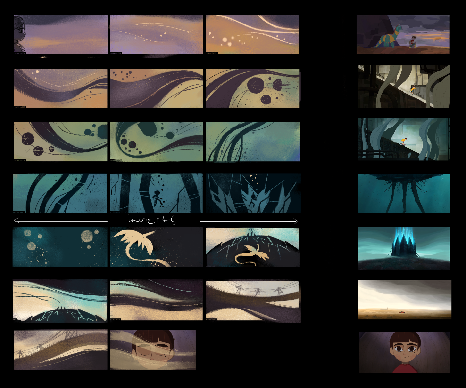
I got to be a bit more 'hands on' for the dream sequence which makes it one of my favourite parts of the film! This sequence has a break in style to the rest of the film and needed a more abstract approach. I created these key images as reference for the animators. I also worked on a colour script that would respect the strong contrast of the keys, but keep some subtle colour that would help transition to and from the sequences on either side. The colours chosen are a very subtle reference to to key moments from earlier in the film.

Character Colour
I was responsible for creating the final colour models for all characters. The palettes were based off concept designs by Rosa Ballester Cabo. We wanted to create a 'lineless' style that stayed true to those concepts, so compositor Damien Welsch developed tools which made the outer lines more subtle, while the interior lines remained contrasted for clarity of design and movement. Elements such as fur and hair also had a specific texture. This complex approach required a lot of communication between the DIP (digital ink & paint) supervisor, Helga Kristjana Bjarnadóttir and the comp department. The model sheets therefore needed to include a lot of extra information to describe the line colours and textures.
Compositing
Here you can see a comparison between the raw animation files and a 'workbook image' created as art direction reference for the compositing team.
I created extensive briefing documents for each sequence for the compositing department as the majority of artists were working remotely. These briefings became crucial in communicating the direction and art direction intent for the final look of the film.
They provided a guide for, not only character grading and integration, but also lighting information, texture reference for FX and atmospheric details.
Promotional Artwork
Images below created by Assistant Art Director, Emilie Bach.